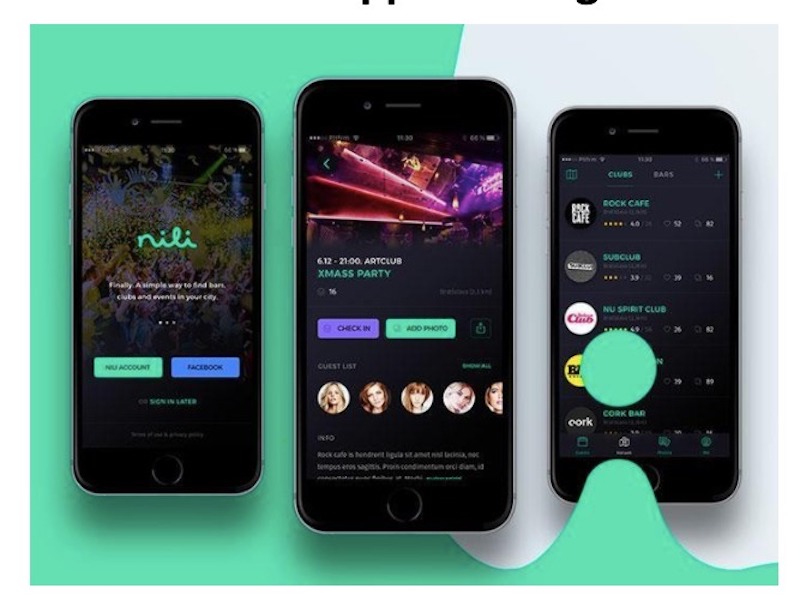
A mobile or eCommerce UX or user experience design refers to designing positive experiences when using mobile devices, apps, or services that run on these devices. With eCommerce website development, the mobile user experience design strongly puts focus on discoverability and efficiency. The innovations and vastness of the eCommerce websites today are transforming visitors into prospective buyers and to become returning buyers.
Why UX is Important
The user experience connects to users with products, which fulfill the needs and requirements of users as well as fulfill the brand goals. The UX furthermore helps build a product or service that’s extensive, useful, and gratifying. Doing so would boost user engagement, conversions, and of course revenue.
UX design is critical, and what defines market leaders. Consider your own experience with Amazon, Google, and Apple products. Apple was not the first to invent the smartphone. On the other hand, Amazon was not the first eCommerce retailer either. What they have done was change how users interact with these products, which makes them easy to use. These big companies invested millions of dollars in the UX design of their products, contributing to growth in sales and revenue.
To be on the competitive edge, every eCommerce website should have a high- quality UX design. Without it could hurt the sales and revenue in different stages.
If the design is not innovative and simplistic, it could harm the rankings of websites since all search engines emphasize on easy to navigate portals. This makes eCommerce mobile services, such as a Shopify development company necessary for web store owners.
Build an Amazing eCommerce Mobile UX Design with these Tips
These are several tips to create a wonderful UX design for an eCommerce website to make the buying experience of a user worthwhile and enjoyable.
1. Horizontal filtering. The majority of websites make use of interfaces that carry left-hand vertical sidebar filtering. At present however, horizontal filtering has gained popularity. This is because it provides certain benefits, such as:
– Tablet and smartphone-friendly, thus filters could be seen while scrolling and the full page width could be used.
– Utilization of page width. The design has bigger visuals with useful and better information that could be put on a page.
– Use of sliders, paragraphs, and tablets, together with checkboxes, which is easier due to the flexibility of horizontal filtering.
2. No websites overloading with product information and CTAs. Making descriptions of a product understandable and crisp, which is necessary since any customer or user doesn’t want to go through massive texts.
● Knowing the audience well. Determine what aspects are attracting customers or the ones that cause them inconvenience that should be addressed well.
● Clear CTAs. It’s critical to have a compelling and clear call to action.
● Descriptions that are easy to understand. To developers of eCommerce apps from a reputable mobile app development company always would offer you clear descriptions that contain crusty bullet points, heading, and subheadings.
3. User-centric search fabrication. The search experience you could offer to your customers could either make or break your online sales. eCommerce businesses should forge the points to fabricate a client-centered search, such as:
● Voice search. As per guidelines in mobile application design, voice recognition also should be implemented since it helps web retailers to boost the user experience. It’s all about the speed, convenience and ease. It makes consumers more comfortable that could result in an elevated engagement.
● Image recognition. Images or pictures are immensely important in terms of eCommerce. Always, users would like to see products before purchasing. The recognition of an image should be implemented on each website so users could rely on the products they are buying.
4. Making the right choice amid scrolling, loading pagination, and more buttons. When engaging with an eCommerce website development service provider, it’s imperative to choose how products are loaded on the site:
● Pagination. A process where a small amount of information is offered to customers to they could emphasize certain parts of a page. Users could overview the whole results with pagination, informing them how long the search would be.
● More buttons loading. Websites with a load button option are preferred since users could discover more products, which could make them feel more in control.
● Endless scrolling. By enabling endless scrolling, content continuously loads as a customer scrolls down. This is best for websites with an even content structure. It’s not a good idea for sites that require fulfilling jobs that are goal-oriented.
5. Simple signups and checkouts. Among the different elements in mobile app design, this point holds quite a relevance. Making the checkout and sign up procedures simple is paramount since web users quickly run out of patience.
● Simple onboarding. It’s not recommended to ask a lot of questions at the start. Registration simply calls for the name and email of a user. Later, personal information, such as phone number and address could be asked.
● Single-column structure. The eye of a user would naturally move from top to bottom of a solitary line.
Keep note
*When you implement an entire eCommerce app development process, make sure to deliver products and experiences that fulfill their real requirements. For an amazing eCommerce mobile app user experience design, a lot of focus should be on the visual appeal since it serves as a critical element in fulfilling customer requirements and establishes brand credibility as well. The first impression of a customer should be good, no matter what.
*When you talk about the mobile app UX, credibility should be taken into consideration when you aim to capture the attention of users by informing them of what exactly you have to offer. The about page of the website should be clear, which should also contain information such as an address of a physical store if there is any, phone number, email address, and so forth.
*A UX design investment is a financial win, the same way that long-term merits include not just better return on investment but minimize costs as well. Moreover, the investment provides better customer retention and higher rankings in the Google search. When you keep your UX optimized, you could stay on the competitive edge and enjoy customer loyalty.


Leave a Reply